top of page
mTicket - App Redesign
Figma

Project Overview
Initial Improvements and Wireframes
User Testing
Further Improvements and Interactive Prototype
The Problem: In order to plan a trip, most users leave the app, leading to slower response times and lower sales.
How can we keep users in the app and anticipate their needs and questions?
Key Areas of Improvement and Wireframe Ideation
Easier Trip Planning

To keep users in-app, stations are labelled with connecting T-stops for easy trip-planning and can be favorited for repeated access
More Options

In addition to keeping the list view, the new map view clearly shows the closest stations, connections, and routes based on the user's location
Smoother Check-out

Checkout has been streamlined and now shows amount of tickets being purchased on same page as payment options
User Testing
User Testing Scenario:
You just moved to Andover, MA to start a new job in Boston. You know your new office is close to the Green line and are looking to commute from Andover 3 times a week. Buy the most efficient commuter rail tickets using the mTicket app.
User Testing Methodology:
2 user tests were conducted with an interactive prototype. User were given the above task and prompted to think aloud as they navigated the app. Afterwards, a KJ analysis was conducted to identify and categorize further improvements.
KJ Analysis Results


Further Improvements and Interactive Prototype
After user testing, a number of improvements were made to the prototype, primarily in the areas of visual hierarchy and standardized tapability.

Visual Hierarchy


Visual hierarchy has been improved to make origin/destination station choices more obvious
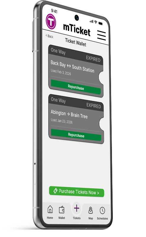
Standardized Tapability


Buttons and icons have been standardized and ticket icon redesigned to promote interactability


bottom of page